Full and comprehensive guide where I brought the images from: link.
Terms
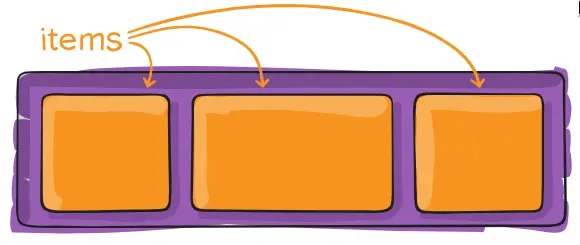
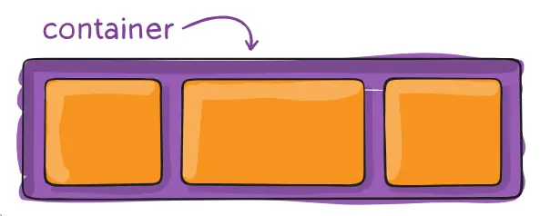
Items and Container
Structure
<div class="container">
	<div class="item">nisim</div>
	<div class="item">shlomo</div>
	<div class="item">david</div>
</div>
.container {
	display: flex;
}
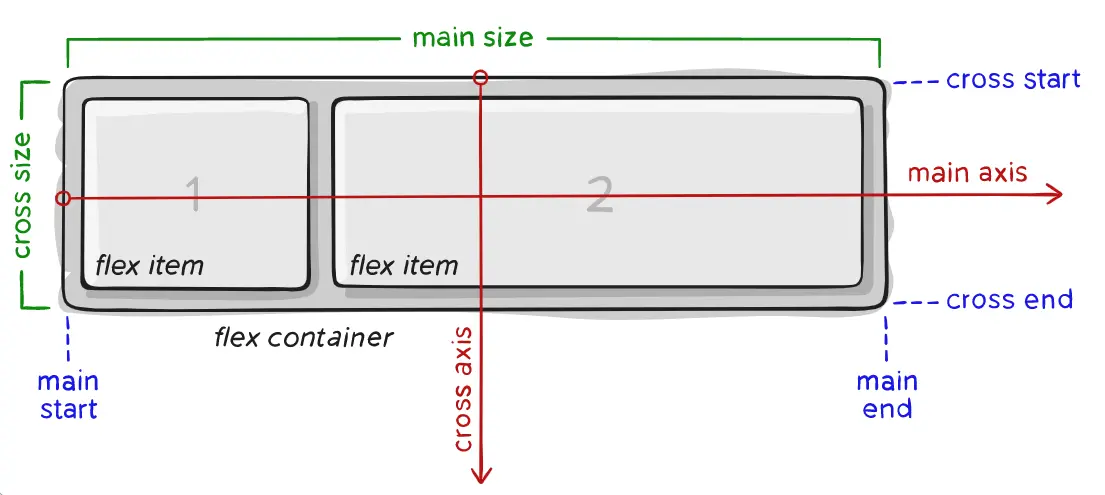
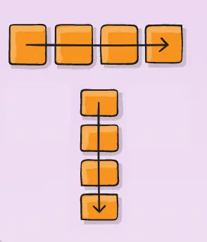
flex-direction
.container {
	display: flex;
	flex-direction: row | column;
}
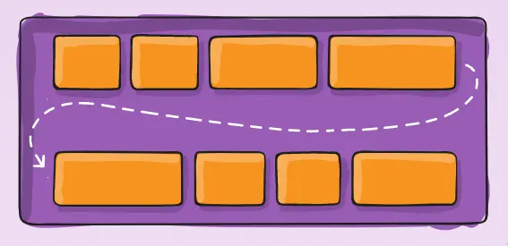
flex-wrap
.container {
	display: flex;
	flex-wrap: wrap;
}
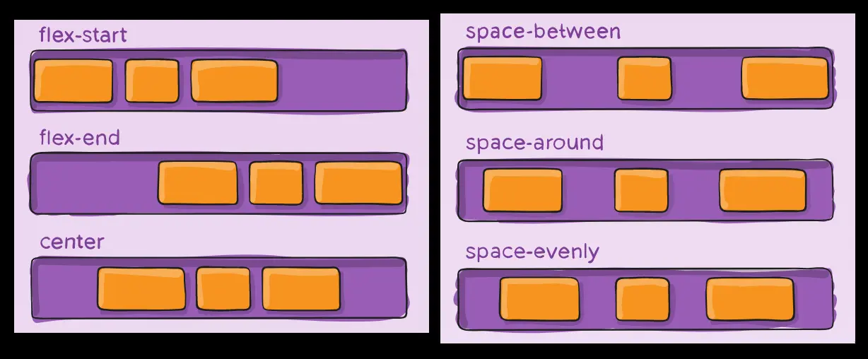
justify-content
What does “justify” mean?

- Justify
- The alignment of text to the left/right/both margins.
.container {
	display: flex;
	justify-content: flex-start;
}
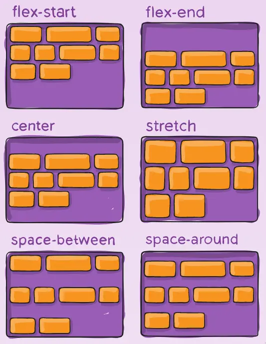
align-items
.container {
	display: flex;
	align-items: stretch;
}

align-content
.container {
	display: flex;
	align-content: flex-start;
}
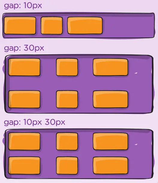
gap
.container {
	display: flex;
	gap: 1rem;
}
Different gap between cols and rows:
.container {
	display: flex;
	gap: 10px 20px;
}